Saturday 1 December 2012

Letterpress yes, but not as we know it

This semester I have been almost exclusively printing using letterpress type and presses, and that has left me in a bit of a dilemma about which blog to post on, this one or the one for our letterpress group, LEN.  So if you've been missing out, you can catch up with some of my recent printing over at: http://len4letterpress.blogspot.com


This week, after a scare over the health of the Vandercook SP15 - my preferred press - I raided the box of type ornaments and other oddities that is kept in the print centre.  As well as stars, intricate patterned border pieces and pointy fingers, I had noticed that there was a big selection of curly brackets so I set myself the challenge of fishing all of these out and printing them.  I was envisioning something akin to the barcodes and striped patterns that inspired my printing on envelopes with the shilling strokes last year.


I set them out pretty much as them came out of the box, and as you can see above there was quite a range of sizes.  For the record, I am aware that this is not the recommended way to lock up your type!  I knew I wouldn't have time to set everything out and pack it precisely, so I went on the theory that as long as there was enough pressure from the sides (as it appears above) then I should be able to get away with trying to fill as many gaps as possible to stop them moving inwards.  I printed on some envelopes and strips of paper of varying thickness, to see how the effect changed.


The results were similar to what I was expecting, though I think the print was more fine and delicate than I anticipated.  When I was setting the type I was reminded of icicles - though that could have just been the temperature messing with me - but the prints make me think of those printouts of peoples heartbeats, ECGs?  It would be good to print a collection of different arrangements, and they lend themselves well to my theme of coded data.

Sunday 7 October 2012

Making covers while the sun shines


It can only mean one thing - another season of Artists' Book Fairs in the offing.

I am trying to become a bit more disciplined about making all of the copies in an edition in one go, so that they are ready in advance for fairs and exhibitions and I don't have that mad scramble to make something to order.  It should also help with the development of my work as having to keep going back and make more of an earlier piece can disrupt my train of thought and new ideas, as well as the fact that it is always difficult to remember exactly the process and measurements used when you have had a gap since making the last one.  Plus of course it will mean there is more space on my table for exciting new things!

(I say all of this with the confession that in reality I am trying to make the remaining copies of an edition of 8, the first 3 of which were completed a few weeks ago.  So it is something of a resolution rather than actual practice at the moment, but definitely something to strive for).

Monday 1 October 2012

Yes yes yes!


Ah, that's better.  First day of term and straight back on the press.  Started things off with a small phrase for a friend, but as these things do that snowballed into a stack of prints, which in turn are destined for a book or two.


Sunday 23 September 2012

The Collecting bug

Colleagues at my current workplace have caught on to my collecting habit and are now finding me all sorts of 'treasure'.  This week there was a bumper haul...

Old catalogue / issue cards

Empty slide cases
The Phone book - on microfiche!
Some great stuff, the only question is where I put it all while I wait for inspiration to strike.

Thursday 20 September 2012

Going global

Somewhat to my bemusement I have some books in different international exhibitions, all at the same time.

I have 3 books in the artists' book exhibition Correspondence which is touring Poland for 2 years.  The exhibition has just reached Lodz and the organisers have sent us this:


The Jozef Pilsudski Regional and Municipal Public Library in Lodz + Polish Book Art Museum
invite you to the 9th International Book Art Festival CORRESPONDENCEpresenting works
of 84 artists from Europe, USA and Asia.

Correspondence


Earlier in the year I was asked to make a book for a French Exchange project involving student book artists from the University of the West of England, Bristol and our counterparts at the Universite Jean Monnet, Saint-Etienne.  Pictures of the finished book still to come, but the exhibition poster and invitation are shown below.

Regards Croises France / Royaume-Uni


I recently received a catalogue for an exhibition including one of my books that has recently been on show in Armenia.  It was part of the celebrations to mark Yerevan - UNESCO's City of the Book 2012 and the 500th anniversary of the first printed book in Armenian.  The exhibition has now returned to the UK and will soon be on show at the University of Northampton, where the books will be kept in the archive. Here is the poster:
Love British Books 2012

Wednesday 19 September 2012

Surfacing

There is quite a lot going on at the moment so information may be in a bit of a jumbled order, but here's a thing happening soon where I'll be showing a couple of small prints.  Come along if you are in the area...


Wednesday 5 September 2012

Sneak preview

A few snaps of some of the work currently under production...


Sunday 2 September 2012

Autumn dates

A summer of planning and making and reflecting is leading up to an Autumn programme of artists' book fairs.  Once again I will collaborating on these with Pet Galerie Press.


On Saturday 15th September we will be at the inaugural Plymouth Artist's Book Fair, being held as a part of Plymouth International Book Festival at Plymouth University.

October sees us in Manchester, where Hot Bed Press have expanded the event to cover Fri 12th and Sat 13th, and including a morning of artist-led presentations and discussions.  We are presenting work at this event under the umbrella of LEN, so all my work will have some element of letterpress.


And in November we will once again be attending the Small Publishers Fair at Conway Hall in London with Impact Press.

Tuesday 5 June 2012

Charity print

Location
Following on with my ideas about data, place and communication I have been printing onto the index from an atlas, contrasting the uniformity and detail of the locational information with large forms of fractured letter pieces.  One of the results has been this set of prints, each with unique locations listed as it is printed on a different page of the index.  Studied in detail it is possible to find familiar locations between the barriers of the over-printed layer, giving a point of reference to the page.  Viewed as a whole there are visual references to printed newspapers, leading to the expectation of a message to be deciphered from the broken text.


Location - detail

In association with a fundraising event in memory of a good friend who died 2 years ago, I am selling this edition of prints in aid of the charities Breakthrough Breast Cancer, The Haven and Shelter.  

Edition of 15, letterpress print (plum black ink on book pages), measuring 17.5 x 26.8cm, £15 unframed (inc. postage).
Larger or higher resolution images available on request.  

Location - shown in 21 x 30cm (A4) frames
If you are interested please get in touch at: hazelgrainger@gmail.com

Monday 21 May 2012

A bit of a bind

As an antidote to all of the writing underway at the moment I have recently participated in a couple of Guy Begbie's bookbinding workshops to hone my skills, practice creating hardback books  - which I don't often attempt -  and learn some new stitches.  Here is a sample:


Multi-section hardback book

Snowshoe stitch through hard-cover

Lightning stitch through hard-cover

Japanese stab binding - Hemp leaf stitch

This Japanese binding is my favourite so far, though it did lead to sore fingers the next day.  I used a red buckram bookcloth which I haven't tried before, and although it seemed heavier and shinier than the more paper-like cloths I usually go for, once it was on the book I loved it, and it seemed a tiny bit more protective.  So far this is the most perfect book I have managed to make - until I spill something on it!

I think the stab binding techniques are the ones I will use most in my books as I often work with loose leaves of paper, I also like the visual effect they create of wrapping around the book, explicitly showing how the pages are held.  I will aim to try out some more of these and perhaps experiment with different papers to get a feel of which bindings are suited to each.

Sunday 6 May 2012

Break

I've been trying to get some writing done for my next module assessment for my MA, coming up at the end of the month, which has meant a break from posting here, but there are plenty of things coming soon to catch up on, I promise.

Firstly, a little something I was involved in during the Easter break.  Not my usual style of working by any means, but a fun experience and chance to enthuse about, and make good use of, our collective typewriters. 
http://www.bookarts.uwe.ac.uk/12secrets.htm

The letterpress print, as ever, tested our problem-solving skills with layout, and gave a new opportunity to explore some of the medium sized metal typefaces.

Saturday 17 March 2012

Sunset


The sun has set on another artists' book fair (Leeds - full report to follow soon), and in fact the last book fair in 'the season' for me as I can't make it to Edinburgh or Glasgow this time around.  So there is a chance to step back and reflect on how things went, what I might change, where I go from here.

Saturday 3 March 2012

On schedule

It's the usual rush to get just a few more books made before the next artists' book fair - which is in Leeds in less than a week.


Today I have been up-cycling some previously made work.  I originally printed these as greetings cards at the end of the print run of bookmarks for the Bookmarks IX: infiltrating the library system project last summer.  They are composed of 6pt letterpress ornaments, packed together to create the pattern and text.  I only had enough ornaments to print a single word, so these cards were put through the press 6 times to achieve this noticeboard look.

At the end of 2011 I up-cycled the leftover greetings cards into notebooks with blank pages, for the abc Christmas market.  I also took these to the Ffotogallery Book Arts Fayre last weekend, where I observed that people were very interested in them, but then looked disappointed when they opened them to find there was no 'book' content inside.  So I have been flexing my rubber stamps and have now added text to the pages, representing examples of delays and the reasons given that I have experienced over my rail travels.


Sunday 26 February 2012

Ffotogallery Book Arts Fayre 6


Had a great time at the BAF 6 yesterday, thanks are due to Helen and the Ffotogallery team.  Hoards of lovely people looking around, amazing venue and fabulous cakes to ogle.  It was THE place to be in Penarth, if not Cardiff as a whole - though apparently there was a rugby match on that held some interest...

We saw some familiar faces behind the other tables, and lots of new ones.  I made a few notes to help with our preparations for the Leeds International Artists' Book Fair but overall I think it reassured us that we are on the right tracks.

I didn't make any new book purchases, but somehow came away at the end of the day with a 50% share in this Zephyr typewriter, rescued from a charity shop near the gallery.  A great find!


Wednesday 15 February 2012

Coming soon to an artists' book fair near you...


As a development of the artists' book fair activities I was involved in last autumn, and once more in collaboration with Pet Galerie Press, in the next few weeks I will be presenting work at:

(25th Feburary, Turner House, Penarth)


and

International Contemporary Artists' Book Fair
(9-10th March, Parkinson Court, University of Leeds)


These are the first artists' book fairs where I will be presenting my work 'independently' of UWE so it feels like quite a change.  Please do come along to see the books and say hello if you are near either!

Pop up HK


This week I received this brilliant pop-up card from Hong Kong.  The 3-dimensionality of the pop up combined with the paper cutting made it instantly recognisable as depicting Tai O, a fishing village on Lantau Island known for its stilt houses.  The imperfections of the subject matter have been expressed in the representation, so the horizontal and vertical lines are not always true, and thicknesses vary, this really appeals to me and gives a warm familiar feel to the piece.


It is made by Hong Kong based Porigami and is one of a set of paper cut designs incorporating single colour printing.

The pop up structure supports itself so it sits open at 90 degrees.


Closer inspection shows it has been laser cut and perforated to produce the folds, but still painstaking work.  I am really impressed by this use of laser cutting to create form from 2D materials, something to think about in my own projects.

Saturday 11 February 2012

The year of the book


Over a year ago I joined the Al-Mutanabbi Street artist's book project, and I wrote about my initial concept on this blog - over here.  With a deadline of one year from signing up to submit contributions there was plenty to time to develop my original ideas which was great, though this led to frequently reversing decisions which was not so great for moving forward.  In the end I took over a year to complete my book, and even then had to make many compromises in the final design just to get it finished.  I think for me it can sometimes be helpful to have a tighter deadline, especially for the making phase, so that I am less likely to get distracted by new ideas.


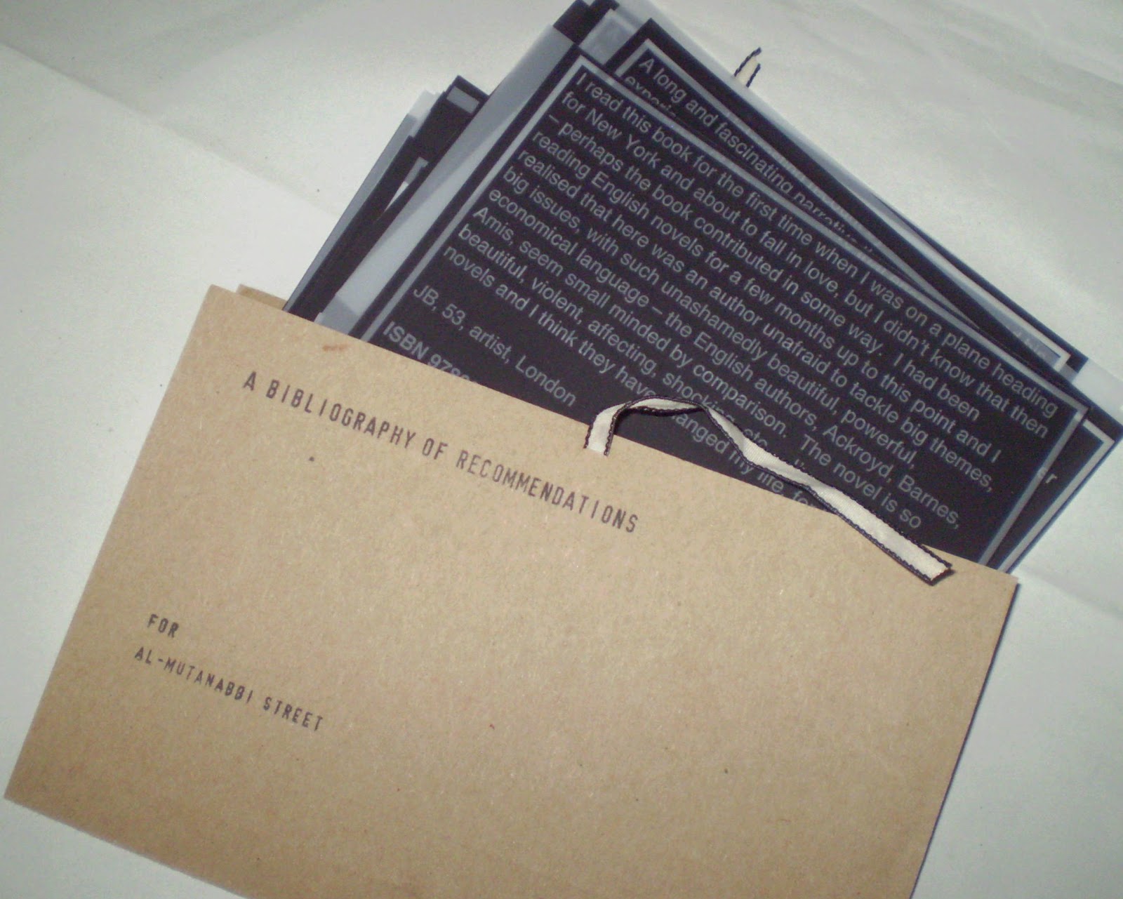
The finished book takes the form of a document folder, reminiscent of those used to carry legal documents.  This was in order to promote the idea that the pages inside are of importance, and to be looked after.


An expanding panel at the sides allows the folder to be easily opened and the loose leaf pages viewed.  It also gives the sense that there is the opportunity for further pages to be added.

Each page contains one person's description of a book that they recommend, and the ISBN number of the book.  The idea being that a reader can decide if the book is of interest without being influenced in advance by the author or a recognisable title.  I wanted to give some indication of the contributor so the reader can see where the recommendation has come from, so I have included their initials, age, occupation and location.  To reflect the connections with the bookselling trade of Al-Mutanabbi Street I also asked participants for details of any work they had done in book shops.


This presentation of abbreviated information continues a theme from some of my earlier book works where contributions have been labelled with a few key details, and feeds into a developing idea about coded data.


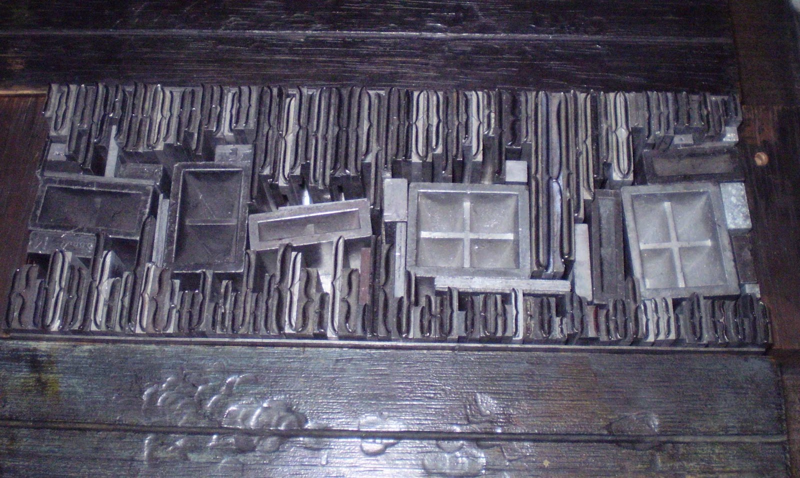
The printing used in the book began as a letterpress project.  I started by setting out one of the recommendations in metal type, and printed onto card.  The next step was an experiment with using flexo plate (flexographic relief plate used in letterpress).  I laid out 4 of the cards in a word document, reversed the image to print onto Folex (a polypropylene plastic also known as mark-resist) and then exposed this onto flexo plate.  The first of these worked well, and I printed a small edition on a Vandercook press which were cut to make A6 index cards. 

Though I was reasonably happy with this outcome, I felt that I had lost the connection with the original inspiration for the project - a set of microfiche.  I found that one of the middle steps of the process, printing onto Folex, gave more of these material qualities and decided to switch to this production method.  


Because I did not require high quality print or colour coverage I printed onto paper and photocopied onto Folex to create the finished pages.  This overall process is evidenced by the borders around the text which were put in for the flexo/letterpress printing stage and remained in the final layout.

Design decisions made early on were changed during production, which reflects how I often work, learning by making and adapting to suit the materials and processes used.  The pages were originally going to be very uniform in size, shape and layout, but this turned out to be very difficult to realise, and on reflection I am pleased with the way each page now appears to have its own characteristics, to show that each recommendation comes form a personal viewpoint.

I feel that I learned a lot during the making of this book, both about technical possibilities and my own working style, and given the chance for consideration there is a lot I can take forward into future projects.


A bibliography of recommendations for Al-Mutanabbi Street
20 loose leaf Folex pages in a custom made expanding card folder with ties,  180 x 120 mm
Edition of 5

Thursday 2 February 2012

New

To fit with the new year (new month now too!), and the start of a new module on my MA, I have been considering how to make this blog work best for me and have decided it is time for a slightly new approach.

In order to try and streamline activities and avoid too much duplication of writing - and, let's face it, effort -  I am going to re-purpose the blog slightly to include on it the reflective writing for my critical journal, that runs alongside my 'made' work.

Another new development is that the Letterpress Etiquette Network (LEN), the research and development group which I am a part of now has its own blog, so until I get around to writing 'critically' about them you can see some images of my recent printing here.