A visual record of the projects I am currently working on, the materials I have found to experiment with, and my reflections on the objects, books, cards, prints, gifts, and other stuff I make.
Sunday, 26 February 2012
Ffotogallery Book Arts Fayre 6
Had a great time at the BAF 6 yesterday, thanks are due to Helen and the Ffotogallery team. Hoards of lovely people looking around, amazing venue and fabulous cakes to ogle. It was THE place to be in Penarth, if not Cardiff as a whole - though apparently there was a rugby match on that held some interest...
We saw some familiar faces behind the other tables, and lots of new ones. I made a few notes to help with our preparations for the Leeds International Artists' Book Fair but overall I think it reassured us that we are on the right tracks.
I didn't make any new book purchases, but somehow came away at the end of the day with a 50% share in this Zephyr typewriter, rescued from a charity shop near the gallery. A great find!
Wednesday, 15 February 2012
Coming soon to an artists' book fair near you...
As a development of the artists' book fair activities I was involved in last autumn, and once more in collaboration with Pet Galerie Press, in the next few weeks I will be presenting work at:
(25th Feburary, Turner House, Penarth)
and
International Contemporary Artists' Book Fair
(9-10th March, Parkinson Court, University of Leeds)
These are the first artists' book fairs where I will be presenting my work 'independently' of UWE so it feels like quite a change. Please do come along to see the books and say hello if you are near either!
Labels:
artists' books,
book fairs,
Ffotogallery,
Leeds
Pop up HK
This week I received this brilliant pop-up card from Hong Kong. The 3-dimensionality of the pop up combined with the paper cutting made it instantly recognisable as depicting Tai O, a fishing village on Lantau Island known for its stilt houses. The imperfections of the subject matter have been expressed in the representation, so the horizontal and vertical lines are not always true, and thicknesses vary, this really appeals to me and gives a warm familiar feel to the piece.

It is made by Hong Kong based Porigami and is one of a set of paper cut designs incorporating single colour printing.
The pop up structure supports itself so it sits open at 90 degrees.
 Closer inspection shows it has been laser cut and perforated to produce the folds, but still painstaking work. I am really impressed by this use of laser cutting to create form from 2D materials, something to think about in my own projects.
Saturday, 11 February 2012
The year of the book
Over a year ago I joined the Al-Mutanabbi Street artist's book project, and I wrote about my initial concept on this blog - over here. With a deadline of one year from signing up to submit contributions there was plenty to time to develop my original ideas which was great, though this led to frequently reversing decisions which was not so great for moving forward. In the end I took over a year to complete my book, and even then had to make many compromises in the final design just to get it finished. I think for me it can sometimes be helpful to have a tighter deadline, especially for the making phase, so that I am less likely to get distracted by new ideas.
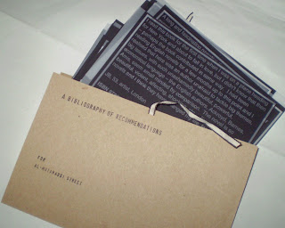
An expanding panel at the sides allows the folder to be easily opened and the loose leaf pages viewed. It also gives the sense that there is the opportunity for further pages to be added.
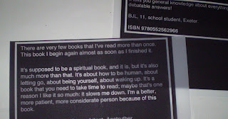
Each page contains one person's description of a book that they recommend, and the ISBN number of the book. The idea being that a reader can decide if the book is of interest without being influenced in advance by the author or a recognisable title. I wanted to give some indication of the contributor so the reader can see where the recommendation has come from, so I have included their initials, age, occupation and location. To reflect the connections with the bookselling trade of Al-Mutanabbi Street I also asked participants for details of any work they had done in book shops.
This presentation of abbreviated information continues a theme from some of my earlier book works where contributions have been labelled with a few key details, and feeds into a developing idea about coded data.
The printing used in the book began as a letterpress project. I started by setting out one of the recommendations in metal type, and printed onto card. The next step was an experiment with using flexo plate (flexographic relief plate used in letterpress). I laid out 4 of the cards in a word document, reversed the image to print onto Folex (a polypropylene plastic also known as mark-resist) and then exposed this onto flexo plate. The first of these worked well, and I printed a small edition on a Vandercook press which were cut to make A6 index cards.
 Though I was reasonably happy with this outcome, I felt that I had lost the connection with the original inspiration for the project - a set of microfiche. I found that one of the middle steps of the process, printing onto Folex, gave more of these material qualities and decided to switch to this production method.
Because I did not require high quality print or colour coverage I printed onto paper and photocopied onto Folex to create the finished pages. This overall process is evidenced by the borders around the text which were put in for the flexo/letterpress printing stage and remained in the final layout.
Design decisions made early on were changed during production, which reflects how I often work, learning by making and adapting to suit the materials and processes used. The pages were originally going to be very uniform in size, shape and layout, but this turned out to be very difficult to realise, and on reflection I am pleased with the way each page now appears to have its own characteristics, to show that each recommendation comes form a personal viewpoint.
I feel that I learned a lot during the making of this book, both about technical possibilities and my own working style, and given the chance for consideration there is a lot I can take forward into future projects.
A bibliography of recommendations for Al-Mutanabbi Street
20 loose leaf Folex pages in a custom made expanding card folder with ties, 180 x 120 mm
Edition of 5
Labels:
al-mutanabbi,
artists' books,
flexo plate,
letterpress
Thursday, 2 February 2012
New
To fit with the new year (new month now too!), and the start of a new module on my MA, I have been considering how to make this blog work best for me and have decided it is time for a slightly new approach.
In order to try and streamline activities and avoid too much duplication of writing - and, let's face it, effort - I am going to re-purpose the blog slightly to include on it the reflective writing for my critical journal, that runs alongside my 'made' work.
Another new development is that the Letterpress Etiquette Network (LEN), the research and development group which I am a part of now has its own blog, so until I get around to writing 'critically' about them you can see some images of my recent printing here.
Subscribe to:
Comments (Atom)


