Over a year ago I joined the
Al-Mutanabbi Street artist's book project, and I wrote about my initial concept on this blog -
over here. With a deadline of one year from signing up to submit contributions there was plenty to time to develop my original ideas which was great, though this led to frequently reversing decisions which was not so great for moving forward. In the end I took over a year to complete my book, and even then had to make many compromises in the final design just to get it finished. I think for me it can sometimes be helpful to have a tighter deadline, especially for the making phase, so that I am less likely to get distracted by new ideas.
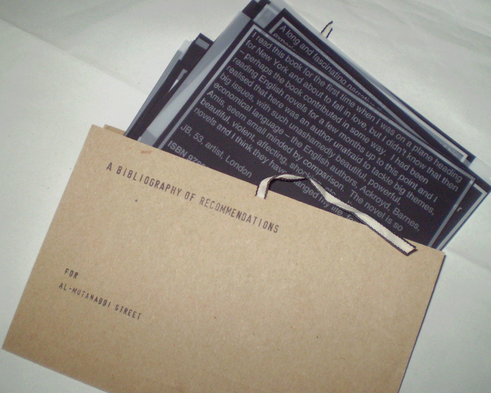
The finished book takes the form of a document folder, reminiscent of those used to carry legal documents. This was in order to promote the idea that the pages inside are of importance, and to be looked after.
An expanding panel at the sides allows the folder to be easily opened and the loose leaf pages viewed. It also gives the sense that there is the opportunity for further pages to be added.
Each page contains one person's description of a book that they recommend, and the ISBN number of the book. The idea being that a reader can decide if the book is of interest without being influenced in advance by the author or a recognisable title. I wanted to give some indication of the contributor so the reader can see where the recommendation has come from, so I have included their initials, age, occupation and location. To reflect the connections with the bookselling trade of Al-Mutanabbi Street I also asked participants for details of any work they had done in book shops.
This presentation of abbreviated information continues a theme from some of my earlier book works where contributions have been labelled with a few key details, and feeds into a developing idea about coded data.
The printing used in the book began as a letterpress project. I started by setting out one of the recommendations in metal type, and printed onto card. The next step was an experiment with using flexo plate (flexographic relief plate used in letterpress). I laid out 4 of the cards in a word document, reversed the image to print onto Folex (a polypropylene plastic also known as mark-resist) and then exposed this onto flexo plate. The first of these worked well, and I printed a small edition on a Vandercook press which were cut to make A6 index cards.

Though I was reasonably happy with this outcome, I felt that I had lost the connection with the original inspiration for the project - a set of microfiche. I found that one of the middle steps of the process, printing onto Folex, gave more of these material qualities and decided to switch to this production method.
Because I did not require high quality print or colour coverage I printed onto paper and photocopied onto Folex to create the finished pages. This overall process is evidenced by the borders around the text which were put in for the flexo/letterpress printing stage and remained in the final layout.
Design decisions made early on were changed during production, which reflects how I often work, learning by making and adapting to suit the materials and processes used. The pages were originally going to be very uniform in size, shape and layout, but this turned out to be very difficult to realise, and on reflection I am pleased with the way each page now appears to have its own characteristics, to show that each recommendation comes form a personal viewpoint.
I feel that I learned a lot during the making of this book, both about technical possibilities and my own working style, and given the chance for consideration there is a lot I can take forward into future projects.
A bibliography of recommendations for Al-Mutanabbi Street
20 loose leaf Folex pages in a custom made expanding card folder with ties, 180 x 120 mm
Edition of 5


 Closer inspection shows it has been laser cut and perforated to produce the folds, but still painstaking work. I am really impressed by this use of laser cutting to create form from 2D materials, something to think about in my own projects.